
Salesforce introduced a flow screen component called Data Table in the Winter '23 release. Using the Data Table in a screen flow, it is possible to display multiple records, just like the list views. Users can select one or multiple records and perform actions according to your business requirements. Alternatively, you can display a list of records without offering any selection options.
Data Table component can display a collection of records. Therefore, first you need to have a record collection variable. In order to build a record collection variable that stores records, you can use the Get Records element or use an Assignment element to add records to your variable. To work with the Data Table, you must use record collection variables. Even if you want to display only one record, you still need to create a record collection variable.
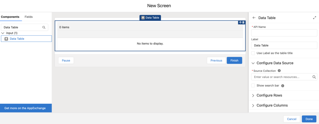
In order to use the Data Table, add a screen element and then add a Data Table input component.
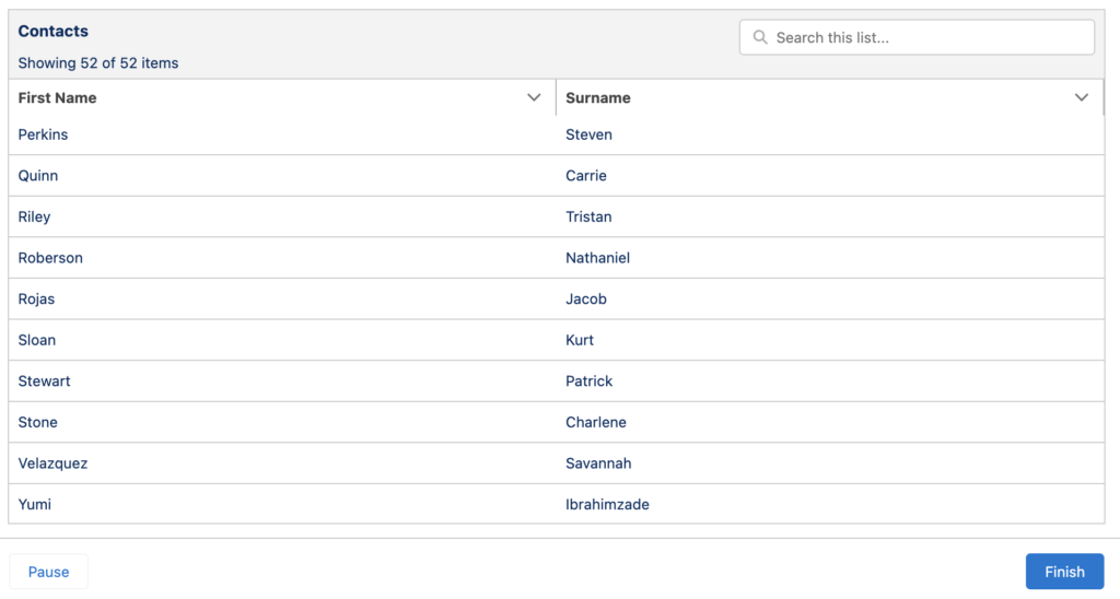
Let's assume that you have a screen flow that gets some contact records that meet a specific criteria.
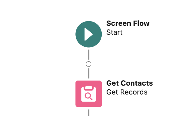
Here is how to configure the Data Table component in order to display those contacts.
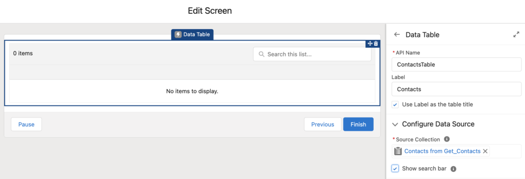
Configure the Data Table Name
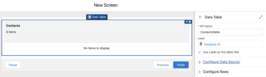
After adding a Data Table component to a screen, just like any other component, type in a unique API Name. Optionally, you can enter a Label and use it as the table title. Once you mark this checkbox, the Label will be visible to the users.
Configure the Data Source
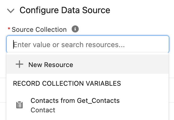
As mentioned before, Data Table component displays a collection of records. Therefore, you have to select the data source (a record collection variable) that you want to display as a table.
You can create a new record collection variable, or use an existing one. In this example, let's choose Contacts from Get_Contacts. This is a record collection variable that flow created after getting the contacts.
If you want to display many records, you can optionally show a search bar. This option allows users to search the Data Table results.
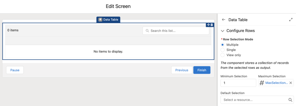
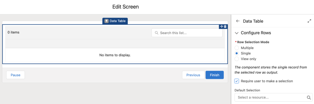
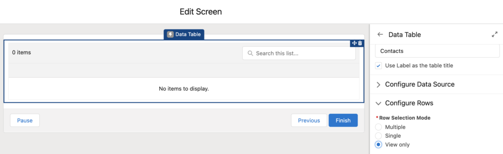
Configure the Data Table Rows
In this section, you can allow the users to select records or make the table read only.
Row Selection Mode indicates how many rows the user can select in the table.
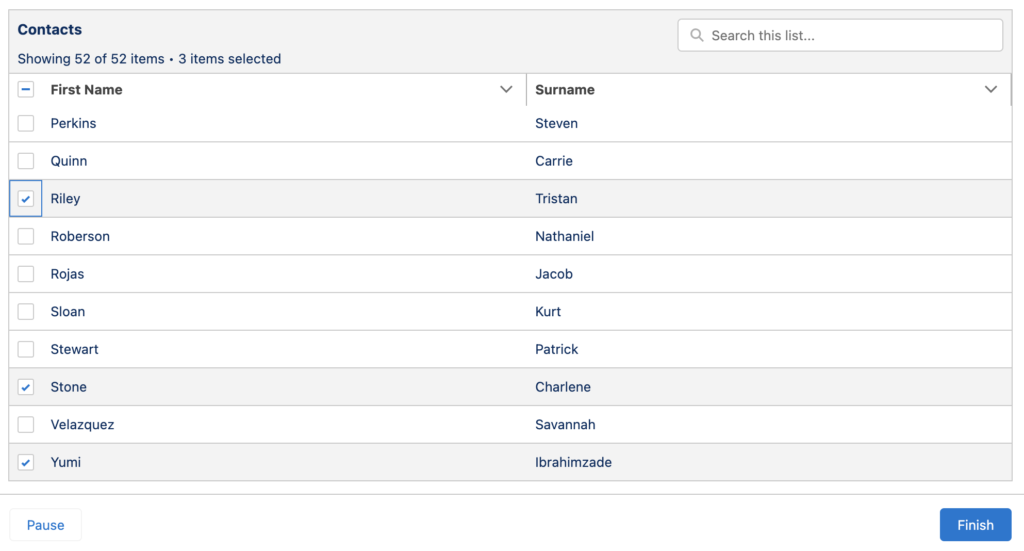
If you allow the users to select multiple rows, you can set the minimum and maximum selection values. In order to make the selection mandatory, set the minimum selection value as 1. Moreover, you can select a resource for the minimum and maximum selection values. This way, you can make it dynamic. Secondly, in order to make some rows selected by default, select a record collection as the Default Selection. Default Selection must be a record collection as well. However, if the records in the default selection do not exist in source collection, they won't be selected. At the end, the component stores a collection of records from the selected rows as output.
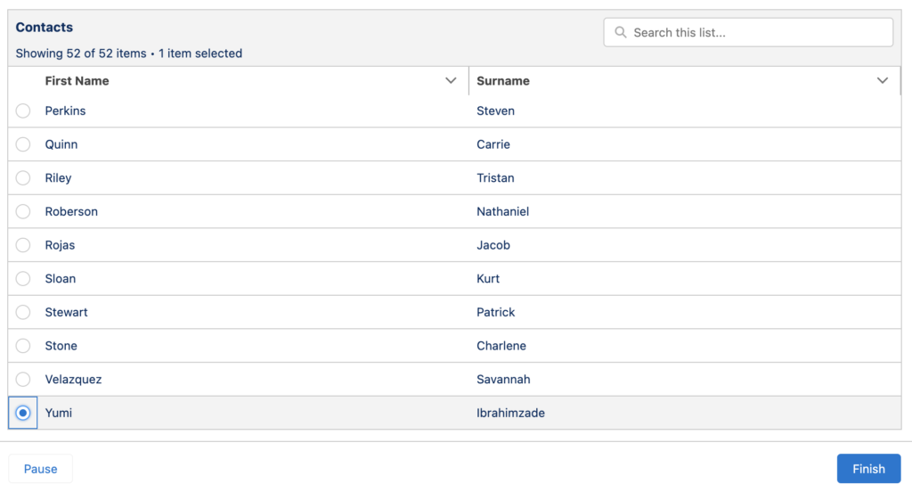
If you allow the users to select a single row, you can make the selection mandatory by marking "Require user to make a selection". Just like the previous option, you can make some rows selected by default by selecting a record collection as the Default Selection. At the end, the component stores the single record from the selected row as output.
The last option is View Only. This mode makes the Data Table read only and the users cannot make any selection. Therefore, there is no additional configuration.
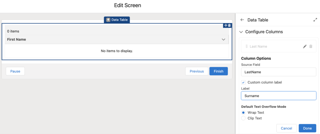
Configure the Columns
Data Table supports showing object fields as columns. Therefore, it is not possible to display variables or formulas that you built in the flow.
In order to add a column, search for the field name from the Source Field. If you want to display another label instead of the field name, mark "Custom column label" and enter a new label. This text is also read by screen readers. In the example below, table displays "Surname" instead of "Last Name". If you display longer values like a description field, you can decide to wrap or clip text.
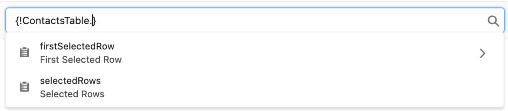
Output of the Data Table
There are two output attributes of this component.
First Selected Row: It is the first record that the user selects. If the user selects multiple records, this output stores the first selected record from top to bottom.
Selected Rows: It is a record collection variable that stores the records that the user selects. Order of the records are according to their position in the table from top to bottom.
After the user makes a selection, you can perform any action that you need. For instance, you can update or delete the selected records.
Here is how the Data Table looks in each selection mode. As you can see, selection boxes change according to the mode. If you use the multiple selection mode, you will have checkboxes next to each row. However, if you use the single selection mode, there will be a radio buttons, which allow only one selection.
Multiple selection mode:
Single selection mode:
Considerations
- Data Table can display up to 1,500 records. However, if you search for a record, it is performed on the entire dataset.
- It is possible to select up to 200 records.
- If you add a lookup or master-detail relationship field as a column, the table doesn’t display the field value. It displays the Id of the record instead of its name. In order to display field values from related records, use object formula fields.
- This component displays Date, Time, and Date/Time fields in the time zone of the machine that the user runs the flow.
- It is not possible to search a Time field.
- If you are using multi-currency, the Data Table component doesn’t support records that are in a different currency from the user’s currency.
- In order to translate column labels, use custom labels as the column titles. You can use the $Label global variable to specify custom labels.
Instead of record collection can we show wrapper data in the datatable ?
Hi,
You can use the custom data table component from UnofficialSF.
It would be helpful to show an example of this consideration:
If you add a lookup or master-detail relationship field as a column, the table doesn’t display the field value. It displays the Id of the record instead of its name. In order to display field values from related records, use object formula fields.
How would one write these object formulas?
Hi Marilyn,
You should create a formula field on the object. It should return the name of the related record. For instance, here is how to show the account name on case: Account.Name
If you want to make it clickable, you have to write it with hyperlink formula.
HYPERLINK('/'&AccountId, Account.Name)
This formula will display the account's name and it will be clickable (just like a regular lookup field).
Hi Yumi,
You dont have idea how much your insight has helped me.
thanks A LOT.
I am happy to hear that!
One thing to note about manually assigning output variables from the datatable (Advanced -> Manually Assign Variables) when Row Selection Mode = Single: First Selected Row returns Null. To get around this you can store Selected Rows in a record collection, loop through this collection and assign the first row to a record variable. You may need to assign each field explicitly though e.g. var_singleRecord.Id = currentLoopItem.Id, var_singleRecord.Name = currentLoopItem.Name etc.
Is there a way to display a formula resource in the data table? I read that configure the columns says it is not possible to display variables or formulas that you built in the flow. Is there any ways to do that now?
You can assign your formula to one of the existing fields of the object and then display it as a column.