
In this post, you will find a component that you can use to validate screen flow input components that do not support input validation.
It is essential to validate user inputs within a Screen Flow before allowing the user to proceed to the next step. While several input components support validation, which enables us to show an error message to the user if their input isn't valid, some components lack this feature.
Components Without Input Validation Option
Some of the main components that lack "Validate Input" support are Picklist, Toggle, Email, URL (although there's limited support via regex), and Data Table. The absence of validation on these components often means resorting to less-than-ideal workarounds.
Possible Workarounds and Their Downsides
One common approach is allowing users to move to the next element even with invalid input. Then having a decision element to redirect them back to the screen for input correction. Another way is adding an extra input element to the screen, which supports validation, to handle the validation for the original component.
Downsides of the First Method: The first approach requires adding an extra decision element after the screen. You may also want to add a Display Text component to show an error message with a visibility condition, making the flow more complex with additional components and conditions.
Downsides of the Second Method: Apart from lacking intuitiveness, it introduces unnecessary input elements to the screen. This could have a negative impact on the visual appeal and potentially lead to user confusion.
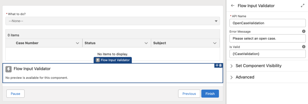
Flow Input Validator Component
To address these challenges, we bring you the Flow Input Validator Component. It is an easy to use component, which enables validation for those components that lack input validation features.
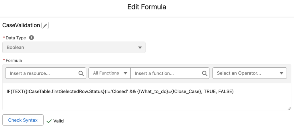
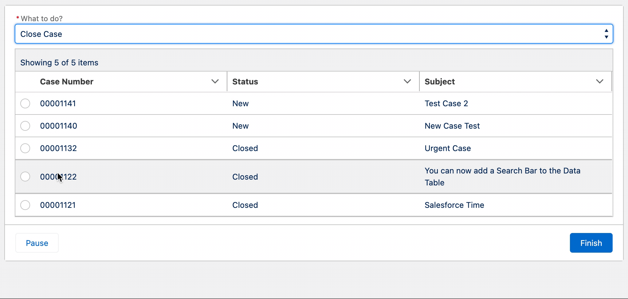
The Flow Input Validator Component is designed to function smoothly with various elements, including but not limited to Picklist, Toggle, Email, URL, and Data Table. It validates user inputs for these components. Moreover, it prevents the need for you to implement workaround solutions that often lead to complicated flows and confused users. There are endless use cases. For instance, you can require users to select a record that meets a certain criteria from a Data Table.
How to Use the Component
1- Install the component using the installation links below.
2- Add the "Flow Input Validator" component to your screen element.
3- This component has two input parameters: Is Valid and Error Message.
Is Valid: Input a formula resource, which returns true when the user input is valid. Make sure that your environment has reactive screen components enabled.
Error Message: Input the message you wish to display for invalid user inputs. It is possible to use a custom label as well.
If you need validation for multiple input components within the same screen, simply add the Flow Input Validator component for each input component. The error message will appear at the specific screen location where you place each component. It provides a clear and intuitive validation, without adding clutter or confusion to the user interface.
Installation Links
Use this link to install in production or developer edition environments.
Use this link to install in sandbox environments.
This is definitely my favorite blog, you come up with great components, right up there with UnofficialSF. Greatly appreciated!
Address fields placed on the screen component can also be validated?
You can use this component for any type of validation.
I used this component for testing, but after the Sandbox was upgraded to Spring 24', it stopped working. The validation rule is triggered now at every save action irrespective of the value of the formula variable I am using to control the validation.
I tried to reproduce the issue but I couldn't. Can you please tell me the steps?
Hi Yumi,
Note the following:
- "GetOpp" is the variable for the Opportunity I am working with in this flow. It is set in a Get Records element earlier in the flow, and gives context to the fields in the screen for this flow.
- The "Arrival_to_Fogo__c" and "Pickup_Location__c" fields are picklists
- My screen uses the record fields feature, which do not yet support validation rules in a Flow screen. Therefore, I am attempting to use this component to provide validation on the screen instead.
I have created a variable called "varPickupLocationValidationCriteria" with the following criteria:
IF(
AND(
CONTAINS(TEXT({!GetOpp.Arrival_to_Fogo__c}), "Shuttle"),
ISBLANK(TEXT({!GetOpp.Pickup_Location__c}))
),
false,
true
)
In my screen component, I have included your component with the above variable in the "Is Valid" field. Upon testing the screen in a debug session, the validation fires no matter what values in the the two fields contained in the rule criteria.
If I set the "Is Valid" field to true, then put my criteria variable in the components "Validate Input Formula" instead. The validation is triggered as expected.
Hi,
I had this use case last week and I am not sure if it will work with the "record fields". It didn't work for me either.
Hi Yumi
I try to install it on my sandbox and get a failure :
Problem:
1. Apex compile failure
Apex class brKnowledgeArticlesService: line 658, column 9: Invalid type: KnowledgeArticleVersion
2. Apex compile failure
Apex class brKnowledgeArticlesService: line 666, column 14: Variable does not exist: versions
3. Apex compile failure
Apex class brKnowledgeArticlesService: line 667, column 37: Variable does not exist: KnowledgeArticleId
4. Apex compile failure
Apex class brUtils: line 41, column 34: Variable does not exist: KnowledgeArticleVersion.SObjectType
5. Apex compile failure
Apex class brUtils: line 44, column 34: Variable does not exist: KnowledgeArticleViewStat.SObjectType
6. Apex compile failure
Apex class brUtils: line 47, column 34: Variable does not exist: KnowledgeArticleVoteStat.SObjectType
7. Apex compile failure
Apex class KnowledgeTestUtils: line 8, column 25: Field does not exist: UserPermissionsKnowledgeUser on User
8. Apex compile failure
Apex class OpportunityTriggerHandlerTest: line 79, column 9: Variable does not exist: BiApiInteractionHandler
9. Apex compile failure
Apex class OpportunityTriggerHandlerTest: line 129, column 9: Variable does not exist: BiApiInteractionHandler
10. Apex compile failure
Apex class OpportunityTriggerHandlerTest: line 161, column 9: Variable does not exist: BiApiInteractionHandler
11. Apex compile failure
Apex class OpportunityTriggerHandlerTest: line 166, column 9: Variable does not exist: BiApiInteractionHandler
12. Apex compile failure
Apex class OpportunityTriggerHandlerTest: line 183, column 9: Variable does not exist: BiApiInteractionHandler
13. Apex compile failure
Apex class ZCampaignAutomationTest: line 55, column 3: Variable does not exist: BiApiInteractionHandler