Salesforce Flow is a powerful declarative tool that enables the creation of complex automations. Standard elements and components provide extensive functionality without requiring any coding. With these, you can freely modify records, use predefined actions, and apply custom logic to your processes. Although standard elements are all you need most of the time, sometimes you may need custom solutions. If a business requirement is beyond the scope of the standard tools, seeking a developer's help becomes necessary. However, it doesn't mean that you have to give up on building the flow. Instead, you can use a custom invocable action to invoke code from a flow.
What is an Invocable Action?
Developers can package useful code functionality into declarative building blocks using the Invocable Actions mechanism. These building blocks are designed to be used by admins and other non-coding users in an expanding range of Salesforce tools, such as the Flow Builder.
To create an invocable action, begin with an Apex class that performs a helpful task with inputs and outputs. Then, identify which inputs to make available to admins in tools like Flow Builder and specify the outputs that will be provided once the task is completed.
In order to call an Apex method from Flow, you should annotate the method with @InvocableMethod.
Invocable Actions in Flow Builder
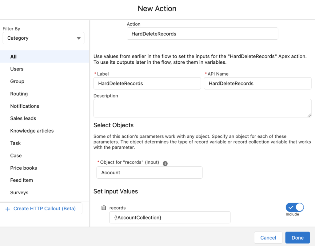
In order to use Apex defined invocable actions, add an action element to your flow and search for the action. Then, provide values for the input parameters.
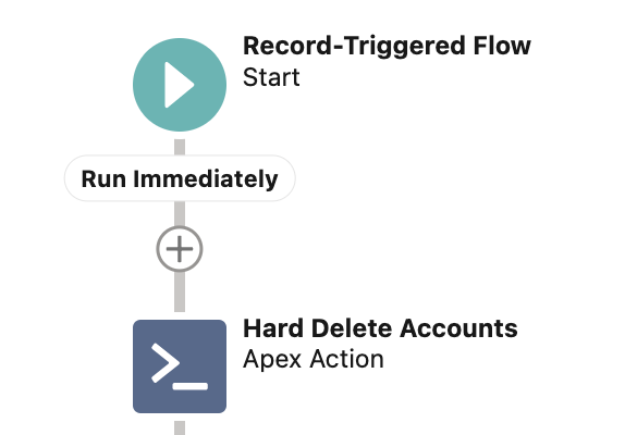
After adding an invocable action to the canvas, it displays the lightning icon by default.
In the Summer '22 release, Salesforce introduced an option to add custom icons to Apex-defined invocable actions. Invocable actions can now have their own unique icons in Flow Builder (only in auto-layout).
How to Add a Custom Icon to an Invocable Action
In order to set the icon for your invocable action, upload a valid SVG file as a static resource or select a Salesforce Lightning Design System (SLDS) icon. Then set the value of the iconName attribute of the InvocableMethod annotation. When a user adds the invocable action in Flow Builder, the custom icon appears on the Flow Builder canvas as the icon of the action. This makes the action easier to find on the canvas.
Here is the format that you should follow.
- Using a Salesforce Lightning Design System (SLDS) icon
@invocableMethod(label='Label of the Action' iconName='slds:category:name')The value should start with 'slds' and continue with two parameters. 'category' is the name of the category of the icon and 'name' is the name of the file in SLDS.
Example:
@invocableMethod(label='Hash Text' iconName='slds:custom:custom76')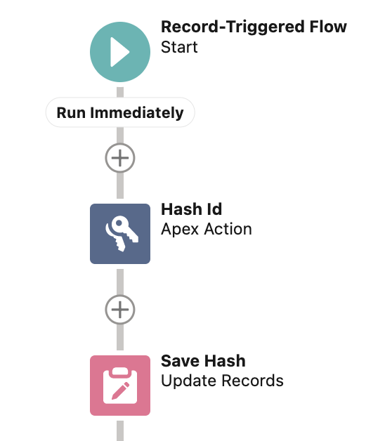
- Using a custom icon from an SVG file
@invocableMethod(label='Label of the Action' iconName='resource:namespace__iconName:svgID')The value should start with 'resource' and continue with three parameters. 'namespace' is the namespace of the package that includes the invocable action. If the invocable action is in a managed package, namespace__ is required. 'iconName' is the name of the static resource and 'svgID' is the value of the id attribute of the element in the SVG file.
Example:
@invocableMethod(label='Hash Text' iconName='resource:Lock:top')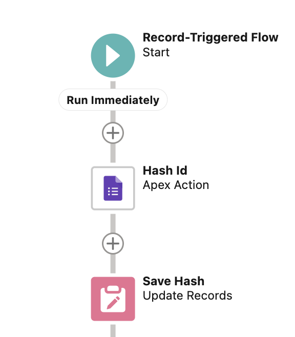
Considerations
1- SVG files must meet these requirements.
- The <svg> element in the file includes the id, xmlns, and viewBox attributes.
- The <svg> element in the file doesn’t include the style, height, and width attributes.
- The file doesn’t include a <clipPath> element.
- Each <path> element in the file includes a fill attribute.
2- You can use only Standard Object and Custom Object SLDS icons as custom icons for Apex-defined invocable actions.
3- Custom icons are available in auto-layout only.
4- If there is an error, Flow displays the default lightning icon.
Leave a Reply