
Global variables are system provided variables that give information about the Salesforce org or running user. They exist in every flow and you cannot create or edit global variables in the flow. They give your flow access to useful data that can be different whenever the flow runs. For instance, user's Id or the current date time. Although most of the global variables are available in all the flow types, some of them are available only in specific flow types. For example, Record global variable contains the triggering record’s values. Therefore, it is available only in autolaunched flows with triggers (record triggered or scheduled flows). Although there are many global variables that give you useful information, there is no global variable about the user's device. Therefore, it is not possible to build a flow according to the user's device.
If you are familiar with Lightning pages, you can use the Form Factor to display components on different device types. However, Form Factor, which represents the user's device type, is not available in flows. Therefore, it is not possible to build a flow that behaves differently according to the device type.
In Lightning Aura Component, there is a global value provider called $Browser. It returns information about the hardware and operating system of the browser accessing the application. This global value provider stores the Form Factor and many more useful information such as iOS, Android, iPhone, etc. In this post, you can find a component that uses the $Browser global value provider and returns all the information that $Browser has. Using this component, you can build flows that behave differently or display different components according to the user's device.
Build a Screen Flow that Behaves Differently According to the User's Device
Let's build a screen flow that displays top 5 accounts in a data table. If the user is running the flow on desktop or tablet, show 4 columns. Since it won't fit the phone screen, let's display 2 columns on phone.
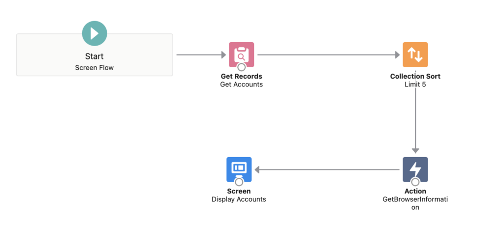
1- Install the component and create a new screen flow (installation links are at the end). Then, add a get records element to get all the accounts.
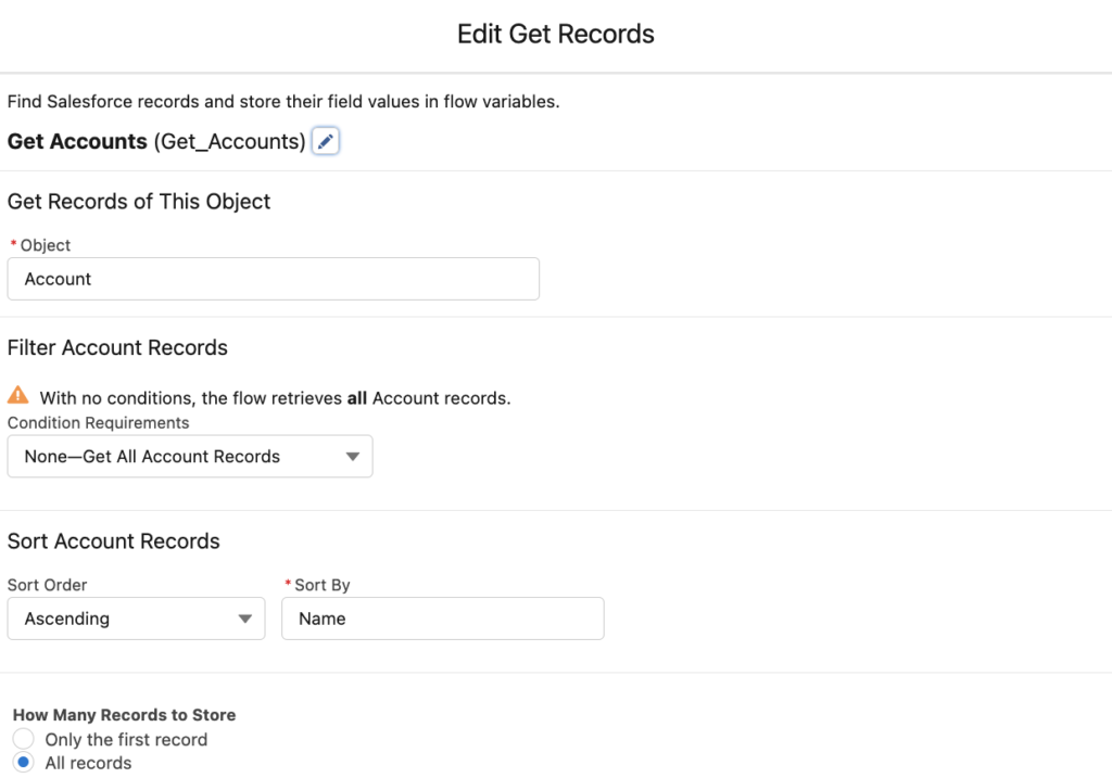
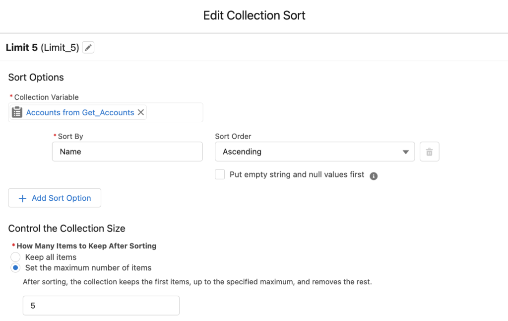
2- Add a collection sort element to keep the top 5 accounts. You can sort by anything that you want but in this example, let's sort by the name.
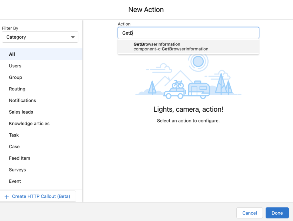
3- Add an action element and search GetBrowserInformation. This is the component that you installed.
This component returns 8 different information about the user's device. These outputs are Android, formFactor, iOS, iPad, iPhone, Phone, Tablet, and WindowsPhone. As you can see, formFactor is a text but the rest of them are booleans.
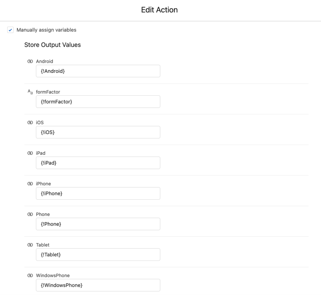
Create variables with correct data types and store the outputs of the action into your variables. You don't need to store everything though, store the ones that you need in the flow.
4- Add a screen element and put some sections, display texts, and data tables.
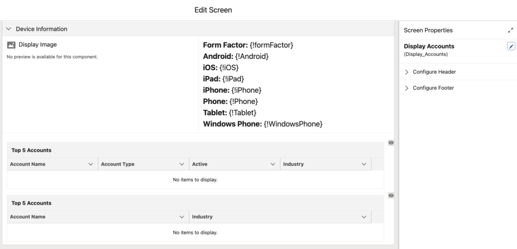
Although the main goal of this flow is to display different data tables depending on the device type, I added a few more elements. Display image element will display a desktop, tablet or phone icon depending on the form factor. On the other hand, display text element on the top right side will show all the outputs of the component.
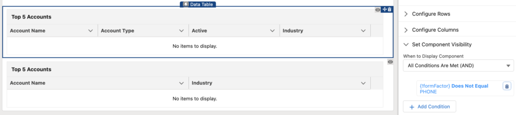
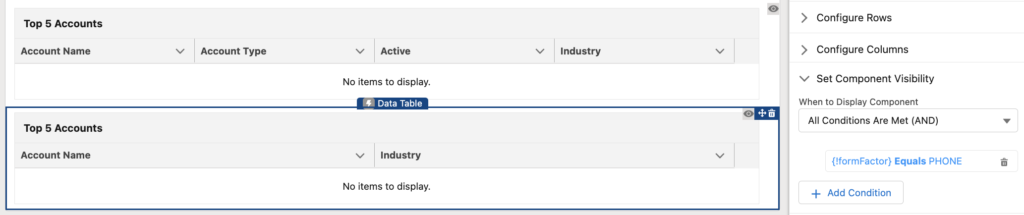
Both data tables display the same data but with different number of columns. Using the form factor and component visibility, you can display the first data table on desktop and tablet, and second one on phone.
At the end, your simple flow should look like this.
Result
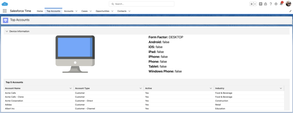
As you can see, this flow displays a desktop icon and a data table with 4 columns on desktop.
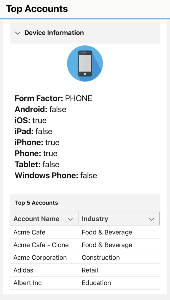
Same flow looks like this on iPhone. As you can see, it displays a phone icon and a data table with 2 columns. Form factor is phone (in capital letters), iOS is true, iPhone is true, and Phone is true.
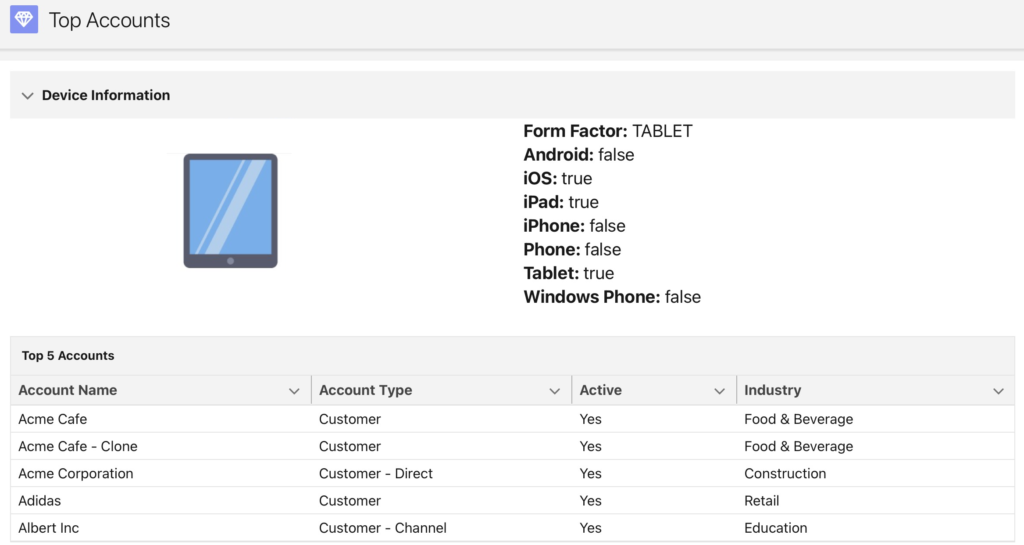
Lastly, it looks like this on iPad.
Important Notes
- Since it is a lightning component that you call as a local action, you can use it only in screen flows.
- Form Factor returns DESKTOP, TABLET or PHONE.
- Due to changes made by Apple, this component (and also $Browser) returns iOS=false for MacOS desktop.
- Due to changes made by Apple, isTablet may be deprecated for iOS devices because $Browser may no longer distinguish between iPad and MacOS desktop.
You can read more about the $Browser global value provider from this link.
Installation Links
Use this link to install in production or developer edition environments.
Use this link to install in sandbox environments.
Wow. Super interesting. Is this a component/action you made? I see your links at the end, but is there an info page for it? Also, where did the form factor images come from? Are they part of the action or did you have to upload images as resources? Thanks!
Yes, it is an action that I made (Lightning Component). It uses the $Browser global provider, which stores some information about the device (including form factor). Form factor images are some static resources that I uploaded. I display them conditionally. They are not part of the package/action, I just used them in the example 🙂
is the mobile version that you are sharing via salesforce App or Mobile web?
Hi,
It is the Salesforce mobile app.