
Salesforce's Summer '25 release is coming soon to our environments. Like past releases, it brings great features for Salesforce Flow. Check out the new flow features of Summer '25 release.

1- Flow Canvas Enhancements
Canvas element icons have been upgraded to modern canvas cards, bringing enhanced functionality right to the canvas itself. Additionally, opening an element’s panel is as easy as a single click!
Moreover, with the Summer '25 release, now you can control the zoom of the Flow Builder canvas with your mouse wheel or trackpad.

2- Email Configuration Enhancements
The Send Email core action’s configuration has changed and is now much more intuitive.
- Inputs are now grouped under clear sections like Recipient Details, Sender Details, and Email Content.
- It's much easier to configure and understand.
- You can now pass Attachment IDs as a text collection.
- No more manually typing the Sender Type, now you can simply select it from a dropdown.

You can also select Org Wide Email Address, Email Template, and Attachments without using Get Records element.

3- Size Picker in Flow Screens
Using the new Size Picker in Flow screen, you can preview how your screen component will appear across different screen sizes. The size picker offers three options:
- Large (default): Simulates a full-screen view, ideal for full-page experiences or large sections of a Lightning page.
- Medium: Represents modal windows, such as those launched from quick actions.
- Small: Use this for mobile phone views or utility bar components.

4- Granular Layout Control in Screen Flow
The Summer '25 release brings greater flexibility to screen layout design without relying on columns in a Section component. You can now control the width of each individual component, Section, and Repeater instance. Moreover, you can control the vertical alignment of each component to fine tune your layout when padding settings don’t align precisely.
This update also makes it easier to optimize space usage with the Repeater component. You can:
- Set the width of each repeater instance so they appear side by side
- Define the width of child components within each instance
Design cleaner, more efficient screens tailored to your exact layout needs.
Before the Summer '25 release, this was possible only with the help of the Style Overwrite component.

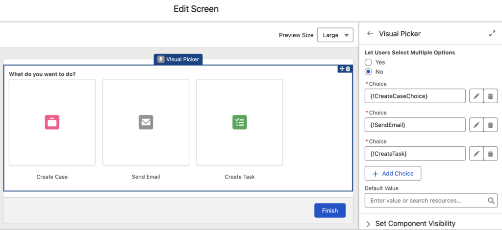
5- Visual Picker Screen Component
There is a new screen component in town!
You can create a more interactive and user friendly selection experience with the new Visual Picker component. Visual Picker component offers larger click targets and a visually rich interface your users will love.

6- Associate Icons with Choices
It is now possible to enhance your standalone Choice resources by associating them with Salesforce Design System icons. You can then use these choices in Choice Lookup or Visual Picker components to create a more intuitive user experience.


7- Time Data Type
After a very long time, Flow finally supports Time as a separate data type from Date/Time.

You can also use time functions in the formula editor, such as HOUR(), MINUTE(), SECOND(), MILLISECOND(), TIMENOW(), and TIMEVALUE().
8- Invocable Action Configuration Enhancements
The Summer '25 release introduces powerful enhancements to invocable action configuration. With these updates, invocable action developers can:
- Control the order of input fields, rather than relying on default alphabetical sorting
- Group related inputs into labeled, collapsible sections
- Conditionally display inputs based on other inputs
- Define a set of predefined values for dropdown lists
- Offer custom components for individual inputs
9- Retirement of the X/Y Location References
Flow elements have obsolete X/Y location references in the Flow XML file. These references are being retired to make it easier to compare changes between versions in your version control systems. For example, the following two Flow versions don’t have any real differences. The only change is the location of a specific element. However, due to this, the versions appear different.

10- Improved Debug Panel Experience
The Flow Debug Panel is getting a major upgrade, making it easier than ever for Flow Builders to identify and resolve issues in their flows. With enhanced filtering, search capabilities, and clearer formatting, debugging Record-Triggered, Autolaunched, and Scheduled Flows becomes more intuitive. Screen Flow support is also on the roadmap for a future release.
Key enhancements include:
- Card-based layout for individual items in the debugger for better readability
- Improved formatting for Records, Record Collections, and Apex-defined types using the same formatter as the Transform element
- Wider debug panel (up to 80% of the screen)
- Search and filter flow elements with highlighted results
- Summary information surfaced at the top of each debug card for quick insights
These updates offer greater visibility and efficiency when troubleshooting complex flows.

11- Reactive Screen Actions Became Generally Available (GA)
Salesforce introduced Screen Actions as a beta feature in the Spring '25 release. This game changing feature allows you to run autolaunched flows directly from flow screens without needing to click a button.
In the Summer '25 release, Screen Actions became generally available (GA).

There are also some enhancements for Screen Actions.
You can now choose when to run an action on screen load, and moreover, set conditions to control when the action should run.

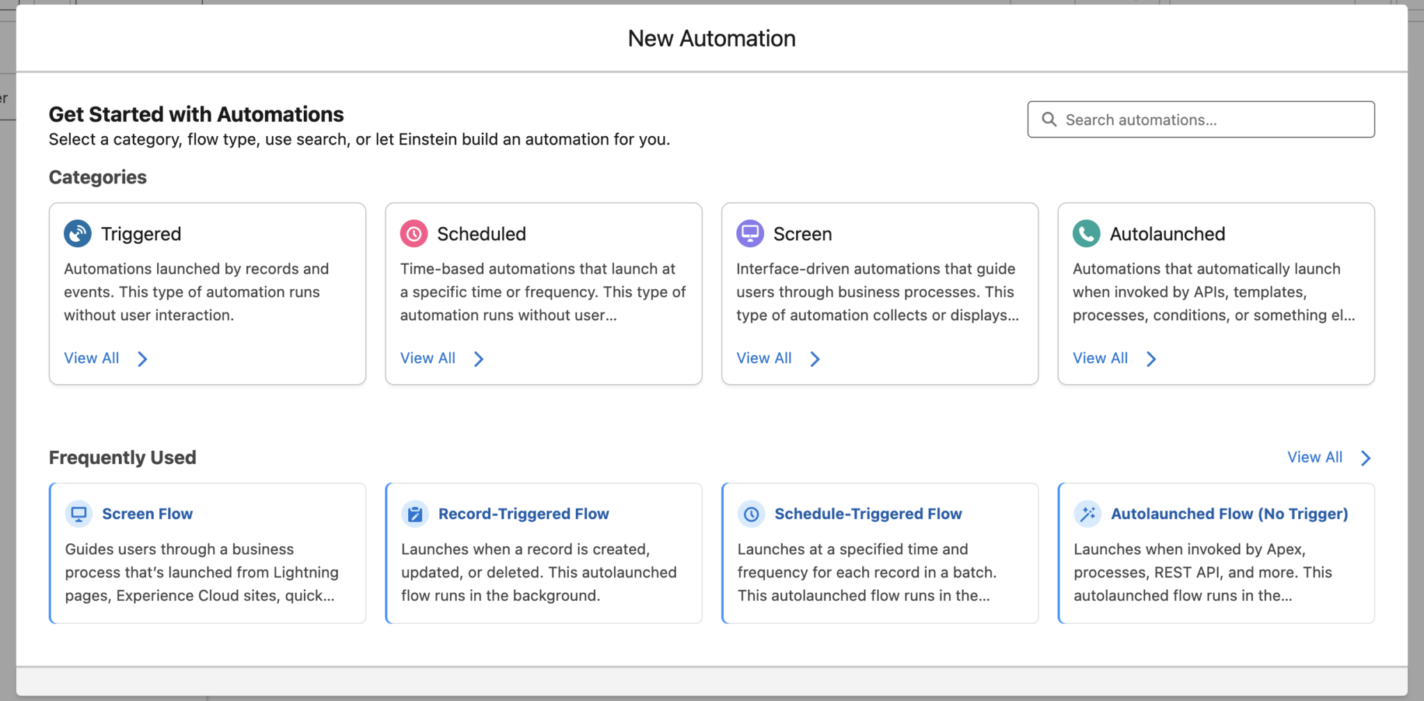
12- Create New Flow Experience
Salesforce introduced a new flow type selection experience in the Spring '25 release. However, it was initially only accessible through the Automation app. Starting with the Summer '25 release, this new experience is also available when creating a new Flow directly from Setup.
13- View Action and Subflow Outputs
Action and Subflow elements now offer a quick, at a glance view of their output resources. No need to click into "Manually assign variables" just to check what they're returning.

14- Expand Search Option in Resource Picker
Salesforce introduced a smarter resource search experience in the previous release. However, after receiving significant negative feedback, it was rolled back before reaching production environments.
In the Summer '25 release, it's back as an optional beta feature that you can enable while searching for resources.

15- File Upload Enhanced (Beta)
Salesforce introduced a new component for uploading files. Since File Upload Enhanced is a beta feature, you first need to enable it in the General Settings under Salesforce Files.

This new component includes an additional parameter that allows you to make file upload required.

16- Select an Entire Resource More Efficiently
The new Entire Resource option in the resource selection menu makes it easier to select the entire resource. Before, you had to choose the resource and then exit the menu without picking a specific field to achieve the same result.

17- Test Flows for Error Handling
Salesforce has added a new operator called "Has Error" to Flow Tests, allowing you to configure negative assertions. You can now test failure paths (when Create, Update, Delete, or Action elements throw errors) to ensure your flows handle them as expected, not just successes.

18- Get Records: Now Supports Related Records (Beta)
Until the Summer '25 release, the Get Records element could only retrieve records from a single object. With the Summer '25 release, Salesforce introduced a new beta feature that allows you to get related records for the retrieved object. For example, you can now get Account records along with their related Contacts, Opportunities, and more, all in a single Get Records element! You can also choose which fields to store and apply filter conditions for each related object.

I've just been playing with some of the new flow features - but this update breaks your 'Style Overwrite' component for Repeaters (again!)
Hope you can update the code for this - I've been exploring it, and it's kinda complex, as you'd know all too well.
Hi Kathy,
Yes, we are aware of that and we are trying to fix it.
However, in this new release, it is already possible to show multiple fields in one row. Would you still prefer to use CSS for that?
Hi Yumi - the in-line 'Remove' button (including one users like which is making that into an X) doesn't work with the native functionality, so the single row still takes up two rows. There are some other things like the lookup component overflow that your component is still required for as well. Thanks!