
There are multiple out-of-the-box selection components in Screen Flow. Although they all let users select a choice or record, each one has a different use case. In the Summer '26 release, Salesforce added a brand new selection component called Radio Button Group to Flow.
Let's see how to use this new screen component and how it differs from the existing selection components.
Radio Button Group Screen Component
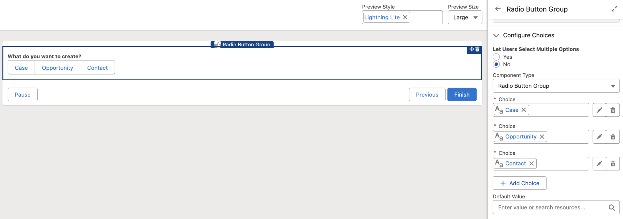
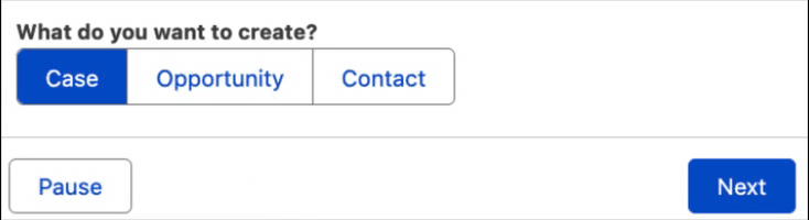
In the Summer '26 release, Salesforce introduced a new screen component called Radio Button Group. It is similar to existing selection components such as Picklist. However, instead of showing the options in a dropdown, it displays them as horizontal boxes on the screen.
Let's see how to configure the component.
The configuration is no different from the Picklist component. You can add individual choices, as well as picklist, record, and collection choice sets. The difference is that this component displays the choices as boxes that look like buttons.
There are a few important notes to keep in mind, as they can play a significant role in deciding whether to use this component in specific use cases.
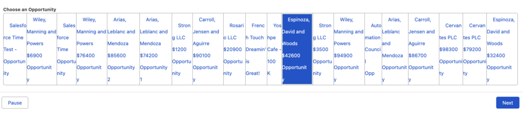
- All choices are displayed in a single row. This means that even if you have many choices, they will still appear on the same line. This is important to keep in mind, because if you display records as choices, the component may not look very user-friendly.
- The choices look like buttons, which may make users feel that something will happen when they click them. They also look similar to the standard buttons of the Screen element. However, this is only a selection component, like Picklist, and the choices are not actual buttons. This may be a bit confusing for users.
Final Thoughts
Although there are multiple selection components in Flow, many people have been asking for this type of selection for a long time. It is very useful in certain use cases, takes up less space, and lets users see all available choices at once.
It is also worth mentioning that this is the only out-of-the-box selection component that displays choices horizontally. Until now, this was only possible with custom solutions such as Style Overwrite.
Leave a Reply